2 Productions Possibility Curve or Frontier Model
Learning Objectives
- Understanding Terminology
- Interpreting Model: Graphs and Table Data
- Understanding Model Components: Scarcity. Opportunity Costs, Productive Efficiency and Economic Growth
NOTE: You must watch the Production Possibilities Curve videos in your LMS learning plan. This text and the videos work together to help you achieve mastery of material.
The Production Possibility Curve is the first model you will study. This model represents our economy at what is called full employment and full production. Full employment means when a society’s resources are all being used with maximum efficiency. Full production means when our nation’s resources(land,labor, capital and entrepreneurial ability) are being allocated in the most efficient manner possible. However, a certain amount of underemployment of resources is built into our model. How much? Although the exact amount is not quantifiable, it is fairly large (10 to 15%). While employment discrimination has declined substantially since the early 1960s, underemployment of resources may still be holding are output to 10 or 15%. Below what it would be if there were truly efficient allocation of resources including human beings. In addition, there will always be machines that not working or being updated or technology that has not been implemented. When we use this model, we are simply trying to discuss how to be more efficient. Remember, the more efficiently we use our resources the less waste and that means as humans we all are able to have more.
Since scarcity is a fact of economic life, we need to use our resources as efficiently as possible. If we succeed, we are operating at full economic capacity. Usually there is some economic slack, but every so often we do manage to operate at peak efficiency. When this happens, we are on our productions possibility curve (PPC). Since we cannot show this in real time – we use a model.
Often economists show the PPC in terms of guns and butter. A country is confronted with two choices. It can produce only military goods or only civilian goods. The more guns it produces, the less butter, and of course, vice versa.
If we were to use all our resources: land labor capital and entrepreneurial ability to make guns, we would obviously not be able to make butter at all. Similarly, if we made only butter, there would be no resources to make any guns. Virtually every country makes some guns and some butter.
You are about to encounter the first model in the form of a graph. this graph and each one that follows will have a vertical axis and a horizontal axis. Both axes start at the origin of the graph, which is located in the lower left-hand corner and is usually marked with the number 0.
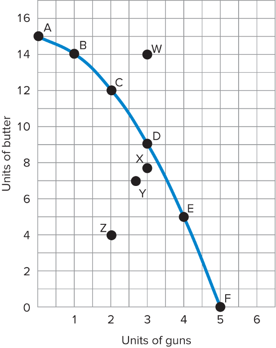
In the graph above, we measure units of butter on the vertical axis. And on the horizontal axis we measure units of guns. As we move to the right, the numbers of guns increases 1 2 3 4 5.
The curve shows the range of possible combinations of outputs of guns and butters extending from 15 units of butter and no guns at point A and on the horizontal axis 5 units of guns and no butter at Point F.
The curve shown in the graph is drawn by connecting points A, B, C, D, E and F. Where do these points come from, they come from a table. Where do we get the numbers? They’re hypothetical. We made them up and in the real world we would collect data and use those numbers. We’ve used hypothetical data here to make learning about the graph a bit easier.
See Productive Efficiency and Economic Growth for explanation of points W, X, Y, and Z.
| Point | Units of Butter | Units of Guns |
| A | 15 | 0 |
| B | 14 | 1 |
| C | 12 | 2 |
| D | 9 | 3 |
| E | 5 | 3 |
| F | 0 | 5 |
The table shows six production possibilities ranging from Point A where we produce 15 units of butter and no guns, to Point F, where we produce five units of gun but no butter. The same information is presented in the graph. We will begin at Point A, where country’s entire resources are devoted to producing butter. If the country were to produce at full capacity using all of its resources, but wanted to make some more guns, it could do that by shifting some resources away from butter. This would move the country from Point A to Point B. Instead of producing 15 units of butter, it’s only making 14.
Before we go any further on this curve let’s go over numbers at Points A and B. We’re figuring out how many guns and how much butter are produced at each of these points. Starting at the origin, or zero, let’s check out Point A. It’s directly above the origin, so no guns are produced. Point A is at 15 on the vertical scale, so 15 units of butter are produced and no guns.
Now let’s move on to Point B, which is directly above one unit on the guns axis. At Point B, we produce one unit of guns and 14 units of butter shown vertically. To locate any point on the graph, first go across, or horizontally, then up, or vertically. Point B is one unit to the right, then 14 units up.
Now locate Point C: two units across and 12 units up. At Point C, we have two guns and 12 butters. Next is D: 3 across and nine up three guns and nine butters. At E 4 across and five up; four guns and five butters. And finally, F: 5 across and zero up, you get five guns and no butter.
Productions possibility curve is a hypothetical model of an economy that produces only two products in this case, guns and butter. The curve represents the various combinations of guns and butter that could be produced if the economy were operating at capacity or full employment.
Since we usually do not operate at full employment, we are seldom on the productions possibility curve. It is what we strive for.
The Production Possibilities model demonstrates 4 things:
- Scarcity or Tradeoffs (Opportunity Cost)
- Law of Increasing Opportunity Costs
- Productive Efficiency
- Economic Growth
Finding Opportunity Cost Using the PPC Model
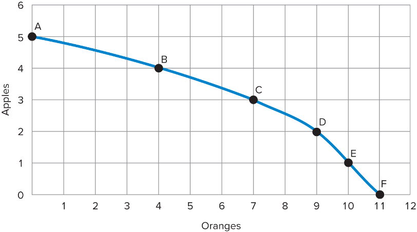
The graph above shows us how many apples and oranges we can produce. The more apples we produce, the fewer oranges we can produce. Similarly, the more oranges we produce, the fewer apples we can produce.
Opportunity cost tells us that we must give up. So, if we increase our production of oranges by moving from point B to point C, how many apples are we giving up?
We are giving up one apple. Next question if we move from point F to point D, how many oranges are we giving up?
We are giving up two oranges. Now let’s take it up a notch. What is the opportunity cost of moving from A to D?
It’s three apples, because at point A we produced five apples, but it point D we are only producing two. One more question what is the opportunity cost of moving from E to B?
It is six oranges, because at E we produced 10 oranges and at B, only four.
Law of Increasing Opportunity Costs
Remember to produce more and more of one good, we have to give up increasing amounts of another good. To produce each additional gun, we have to give up increasing amounts of butter. See videos in learning module for more explanation.
Productive Efficiency
Points A, B, C, D, E, and F on graph
At the beginning of the chapter 1, we defined economics as the efficient allocation of the scarce means of productions(resources) towards the satisfaction of unlimited human wants. The scarce means a production remember are our resources: land, labor, capital, and entrepreneur ability. An economy is efficient whenever it’s producing the maximum amount of output allowed by a given level of technology and resources. Productive efficiency is attained when the maximum possible of output of any one good is produced, given the output of the other goods.
This state of grace occurs only when we are operating on our Productions Possibility Curve. Attainment of productive efficiency means that we can’t increase output of one good without reducing the output of some other good. We rarely achieve productive efficiency or full production in our economy.
Why Society Must Choose
In a previous chapter, we learned that every society faces the problem of scarcity, where limited resources conflict with unlimited needs and wants. The production possibilities curve illustrates the choices involved in this dilemma.
Every economy faces two situations in which it may be able to expand consumption of all goods. In the first case, a society may discover that it has been using its resources inefficiently, in which case by improving efficiency and producing on the production possibilities frontier, it can have more of all goods (or at least more of some and less of none). In the second case, as resources grow over a period of years (e.g., more labor and more capital), the economy grows. As it does, the production possibilities frontier for a society will tend to shift outward and society will be able to afford more of all goods. In addition, over time, improvements in technology can increase the level of production with given resources, and hence push out the PPF.
However, improvements in productive efficiency take time to discover and implement, and economic growth happens only gradually. Thus, a society must choose between tradeoffs in the present. For government, this process often involves trying to identify where additional spending could do the most good and where reductions in spending would do the least harm. At the individual and firm level, the market economy coordinates a process in which firms seek to produce goods and services in the quantity, quality, and price that people want. However, for both the government and the market economy in the short term, increases in production of one good typically mean offsetting decreases somewhere else in the economy.
Economic Growth
Point W on the graph
Looking back the first graph in the chapter, if the Productions Possibility Curve represents the economy offering at full employment, then it would be impossible to produce at point W. To go from C to W would mean producing more guns and more butter, something that would be beyond our economic capabilities, given the current state of technology and the number of resources available. But under extraordinary circumstances could actually produce beyond our normal economic capabilities. See the PPC videos in Brightspace module.
Points X, Y and Z represents where our economy normally operates. Not at productive efficiency. The further away we are for the curve the less productive we are and the closer to the curve the more productive we are.
Access for free at https://openstax.org/books/principles-economics-3e
